Question

Malfunctioning data export (xls) from 100 % stacked graphs

  • 20 March 2024
  • 8 replies
  • 27 views

Hello,

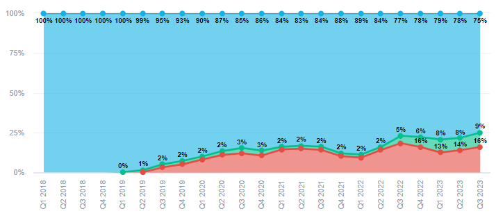
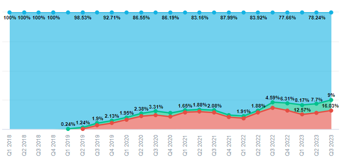
I am trying to export data from dashboards. The exported data does not correspond to what I see in a graph. It seems that numbers are completely different. It probably exports underlying data and not 100 % stacked data.


I am attaching pictures as evidence.


Thanks a lot


8 replies

Userlevel 3

Hello Anastasie, 

Exporting a visualization in XLSX format will always show the underlying data in tabular format. If you wish to see the graph instead, you will need to place the insight in a KPI dashbaord and then export it in PDF format. More details about the export options can be found in our documentation here: https://www.gooddata.com/docs/cloud/create-dashboards/export/#pdf


-Moises

Hello Moises, than you for explaining. I undestand that it shows only underlying data, but could why is data format in % then?

Userlevel 3

You’re welcome. Please note the insight format is also applied to the exported file.

Underlying data is in numeric format such as 2 135 856, but it shows 2 135 856% which is to my understanding incorrect.

Userlevel 3

If you wish to remove the formatting, it can be done from the insight metric format menu as specified in the documentation: https://help.gooddata.com/doc/enterprise/en/dashboards-and-insights/analytical-designer/work-with-metrics/format-numbers/#FormatNumbers-Definecustomnumberformats 

Thank you for explanation


Hello @Moises Morales , I looked further into this and I still see an issue.

I created a 100% stacked area chart and set up the format to Percent (rounded).

When exporting data to Excel, the data has a percent format, but it is applied not to the market share shown in the chart, but instead to the underlying data.

If I want the underlying data to have the correct format, I need to set the format to default, which is a 2-digit %. However, I want the market share to be rounded to the nearest percent.

Therefore, I can't export the data with the proper format without compromising the look of the chart.


Is there any way around this? thank you


Userlevel 3

Hello @anastasie.pustovalova, my apologies for the late reply, this fell between the cracks. I am afraid that exporting the stacked are chart this way is really not desired if you wish to get the resulting tabular report to behave the same way, this is because the data in a stacked area chart or any other chart for that matter may behave differently than a regular table depending on the way it is broken down, formatted, etc.

All in all, XLSX exports work best with tabular insights, therefore, could you try creating a table insight instead and export it? Are you still having issues with the resulting export? If you wish to export a stacked area chart, it is better if you use the PDF format.


-Moises


Reply