Hello community,
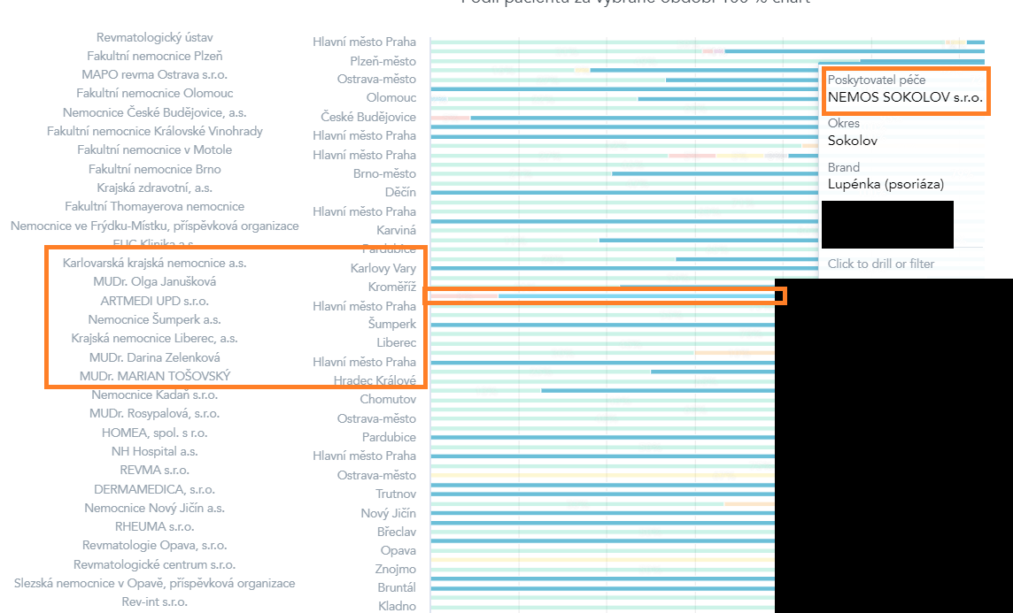
In the dashboard, I'm using a bar chart, and since there are many rows, I extended the graph to its maximum length. However, now I see that there are more bars in the graph than labels for the rows. Some row labels are hidden, so it gives me misleading information.
Is there any way to extend the widget on dashboard more so that each bar matches each row? Being able to scroll down in the graph would also be useful.
Thank you