Solved

Conditional format headline visual comparison percentage


  • Participating Frequently
  • 9 replies

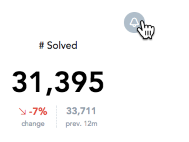
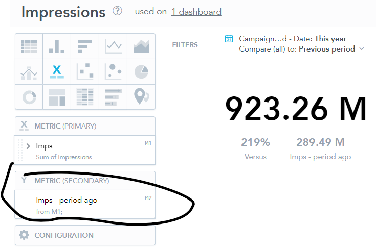
I’ve seen a demo when a headline visual has a comparison versus a previous period, the percentage difference is green/red depending on an increase or decrease vs previous period.

How is this conditional formatting implementeD?

icon

Best answer by Iva Gasparekova 4 April 2023, 11:55

View original

8 replies

Hi,

see here: https://help.gooddata.com/doc/growth/en/how-to-get-started-with-gooddata/share-gooddata/embedding-dashboards/ or https://sdk.gooddata.com/gooddata-ui/docs/embed_dashboard.html .

Please raise a separate new question once the topic is marked as Solved. 

Thanks,

Jakub

Hello, just want to follow up on the above, thanks

Ahh yes you are right, it is the KPI insight!


Are we able to embed KPIs? I am struggling to find the embed option.


Thanks

Userlevel 3

I see, sorry for my misunderstanding here. Could you point me to that demo somehow, please?
Or could it possible, it was actually showing the KPI(Key Performance Indicator ) and not the Insight?


Hello


I don’t believe those first 3 articles apply to the ‘versus’ percentage in a headline vs a previous period, correct?


There is no drop down config option for the y value 


Userlevel 3

Thanks for letting me know.

You can find the instructions in articles linked below:

Formatting Numbers in Insights
Conditional Number Formatting
Color Formatting Reference

Another option would be to implement one of our SDKs and work with advanced Visual components this way.

Hi Iiva


We are using GoodData Platform.


Userlevel 3

Hi,

May I know what product of GoodData are you currently using, please? Conditional formatting might be slightly different in GoodData Cloud and GoodData Platform.

Or if possible, send me a link or a screenshot from your demo, please.

Reply