
Prerequisites
In this article, we are going to go over how to import a workspace layout we have prepared for you. Before we start, please make sure you have installed GoodData.CN, an empty workspace created, a Postgre database set up, and “freelayout.json” downloaded.
What is in the “freelayout.json”?
“freelayout.json” contains the metadata of an existing workspace, the file helps GoodData.CN to duplicate the workspace layout from the existing workspace. It consists of the logical data model (LDM), and metadata of user-defined metrics, insights, and dashboards and tells GoodData.CN how to lay both the frontend and backend of the new workspace accordingly. The layout we provided an example to demonstrate how you can utilize GoodData.CN to achieve your business goals.
Uploading a Layout to a new workspace
Once you have a new empty workspace created, first, find the workspace ID from the empty workspace you have created (If you enter the empty workspace in GoodData.CN, you may find the workspace ID in the URL, like in Diagram 1 below).
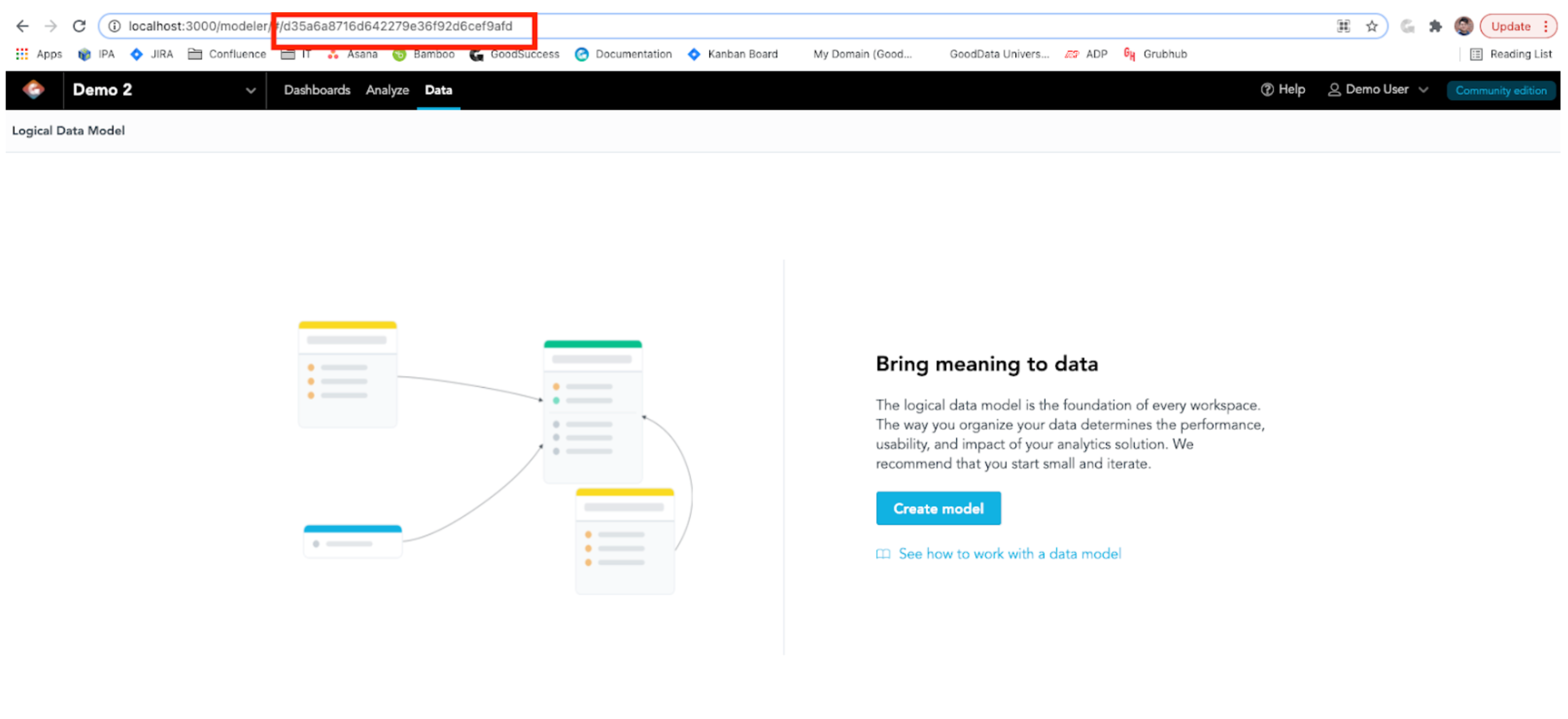
Diagram 1: Find your workspace ID in an empty workspace
After that, you may open your command line and change the directory to where the “freelayout.json” is saved. In the below API call, replace <workspace_id> with your workspace ID and run it on the command line:
curl http://localhost:3000/api/layout/workspaces/<workspace_id> \
-H "Content-Type: application/json" \
-H "Accept: application/json" \
-H "Authorization: Bearer YWRtaW46Ym9vdHN0cmFwOmFkbWluMTIz" \
-X PUT \
-d @freelayout.json
Once the API call is made, refresh the workspace, you will find the workspace is not empty anymore! You may find the LDM is uploaded, and you can start using this workspace!
Note: I have built a workspace called “Free Layout” and I will be using this workspace for the tutorial.
LDM
The LDM stores the data sets we use and their relationships in this workspace. The relationship is important because it describes how the attributes and facts in the data set is related to another and determines how the user-defined metrics are sliced by other attributes. The GoodData.CN Community edition image contains a sample e-commerce data set in the Postgre database. The data set tracks the sales to customers and marketing campaign spendings.
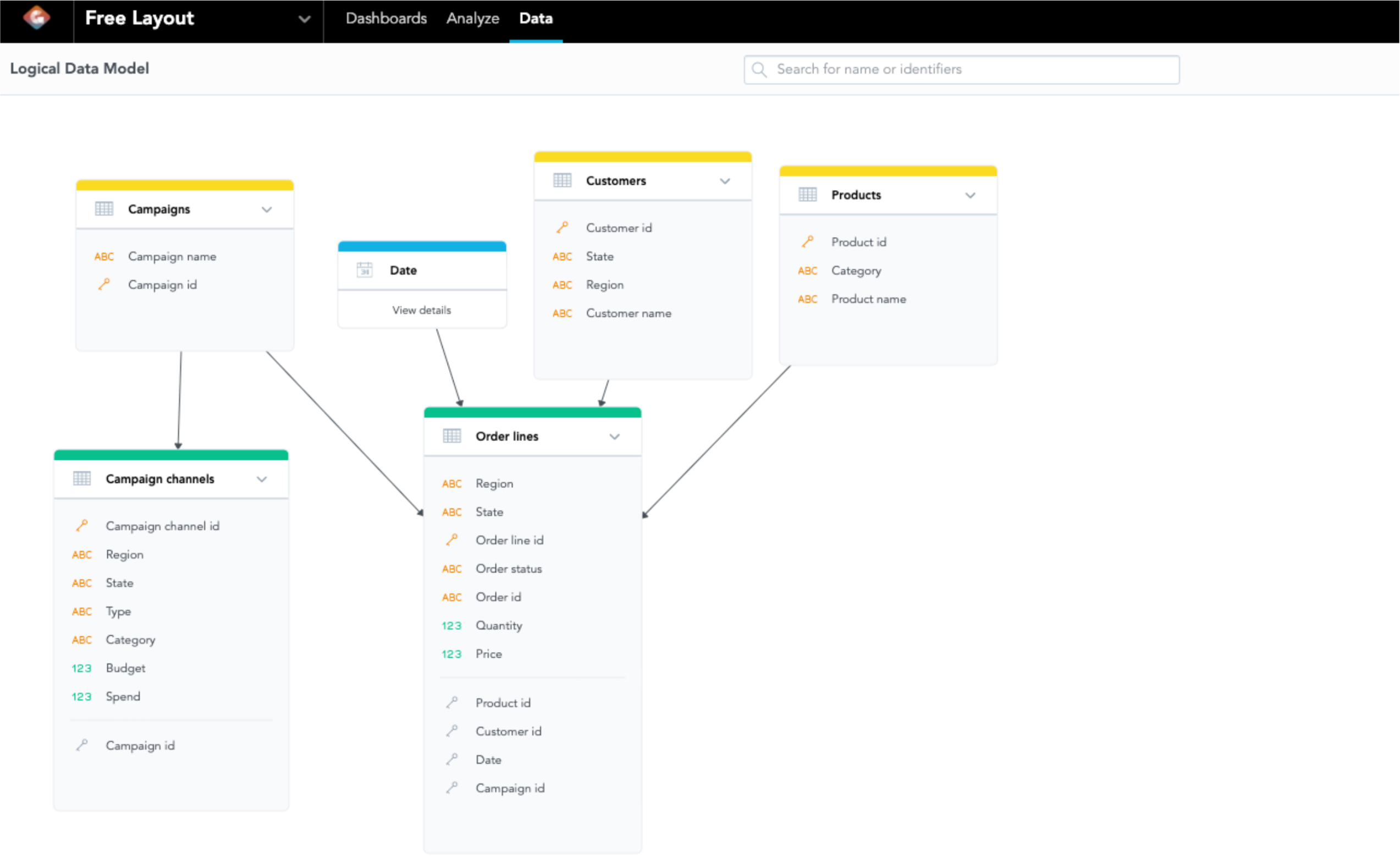
Diagram 2: LDM of “Free Layout” workspace
Once the LDM is uploaded with “freelayout.json”, the data associated with this LDM should have uploaded to your local Postgres database. If you like to learn more about the data or the data is not proper uploaded, you may check the documentation:
In the LDM, you may find there are 2 green tables, 3 yellow tables, and 1 blue table. A green table means that the table has at least 1 fact (A numeric data for building metrics); a yellow table means that the table contains attributes only, which are the columns available for you to slice the facts or metrics in the workspace; a blue table represents the date/time dimension. The arrows represent the relationships between tables and tell you what facts/metrics you can slice by. For example, the “Customers” table is pointing at the “Order Lines” table, so that you may slice a fact on the “Order Lines” table, such as “Quantity”, by an attribute on the “Customers” table, such as “Customer Name”. Having understanding of the relationship among the tables in the LDM allows you to build your metric using MAQL (For more information, please check out the MAQL training course in the GoodData University or other community articles about MAQL).
Note: To access the LDM, click “Data” on the top panel.
Dashboards
After you have a glance at the LDM, you may click on “Dashboards” on the top panel and GoodData.CN will navigate to the dashboards like Diagram 3:
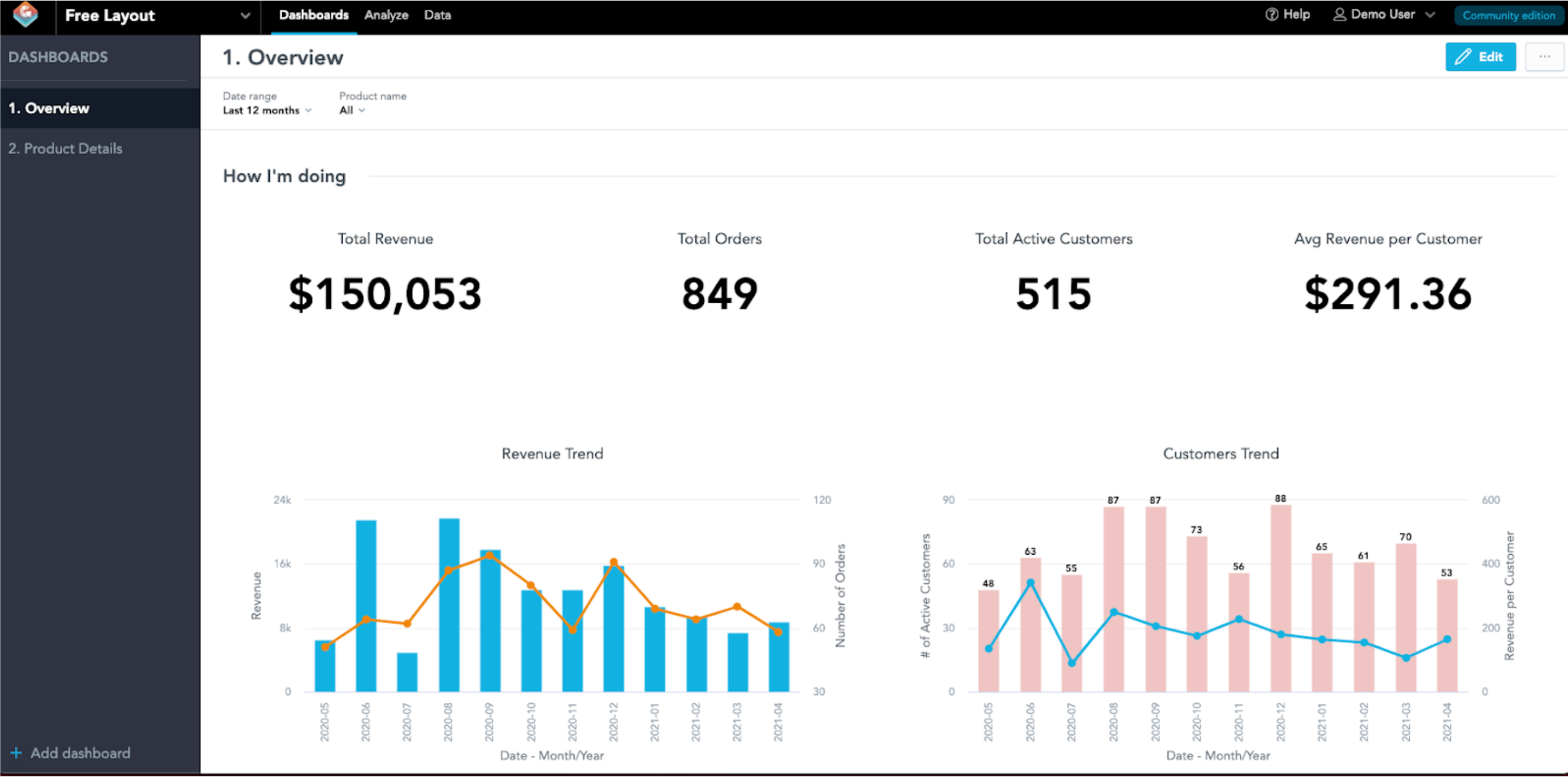
Diagram 3: “1. Overview” in “Free Layout”
There are 2 dashboards in this workspace as shown in the left panel, that are called “1. Overview” and “2. Position Details”. The first dashboard, “1. Overview”, provides the overview of product sales, transaction insights, customer demographics, and campaign spending of the hypothetical e-commerce platform. There are 4 sections in this dashboard. The first section, “How I’m doing”, provides the KPI of overall sales performance and trend of the overall e-commerce platform. It is followed by the section “How my products are doing”, which illustrates the sales by product categories to provide insight of which products are performing well. The third section is “Who my customers are”, which display the top 10 customers the e-commerce platform sold to and the sales portion by region in order to understand who bought the most and the revenue is coming from. “How my campaigns are doing” is the last section in “1. Overview”, it illustrates the budget and spending of each campaign channel to analyze which campaign channels are over budget.
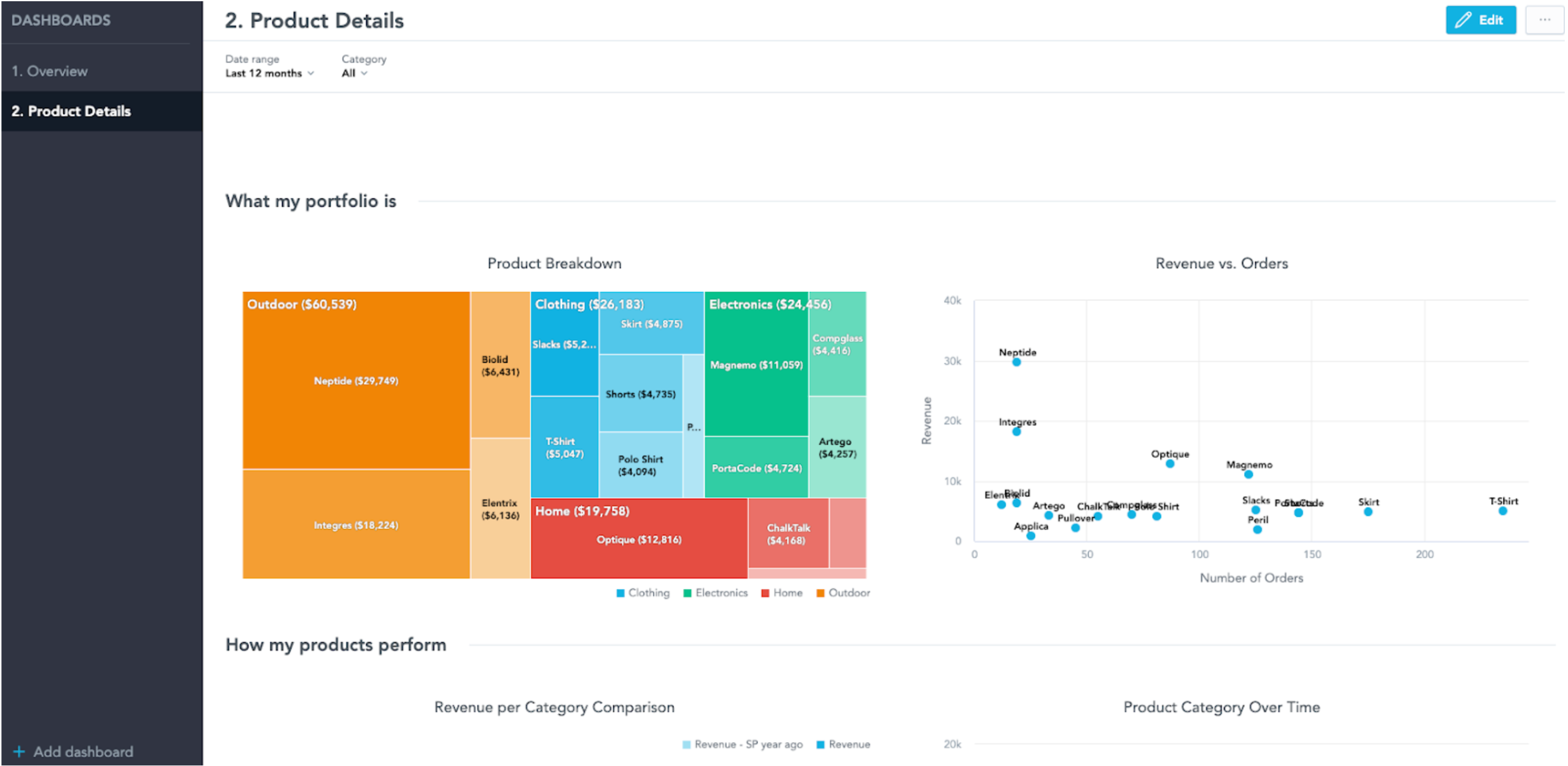
Diagram 3: “2. Product Details” in “Free Layout”
The second dashboard in the workspace is “2. Product Detail”, which is a dashboard that focuses on product sales performance. It has 3 sections including: “How my revenue breaks down”, “What my portfolio is”, and “How my products perform”. The first section of “How my revenue breaks down” displays the KPIs on the 4 different product categories in the e-commerce platform. “What my portfolio is” is the section which illustrates the sales breakdown across products and the volume and sales among products. The last section is “How my products perform” illustrates the product sales comparison across time and provides a table of detailed sales information on each product.
Filters on Dashboard
There are 2 filters in both dashboards that are defaulted to last 12 months and all products as you can see the filters and their values on the top of each dashboard. You may change the filters to fit your analysis needs! Simply click on the filters and change to your desired date range or product. If I am interested in T-shirt sales in the last quarter, I can change the filter and the GoodData.CN will update the dashboard and becomes:
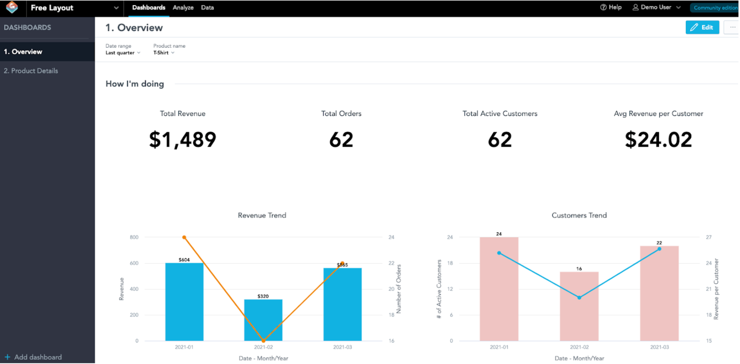
Diagram 4: Overview in T-shirt sales in last quarter
You may add new filters to tailor your needs. To do so, click “Edit” on the top right and you will enter the edit mode of this dashboard. You may see attributes filter on the left panel, drag it to the canvas (Edit mode of this dashboard) and select the attribute you want to filter. Note that the filter only works if the metric is related to the attribute you wish to slice, therefore, it is wise to look at the LDM before adding a new filter. Once you have selected the filter attribute, click “Save & Publish”. In my case, I added a “Region” attribute to my dashboard. If I filter the dashboard to T-shirt sales in the West for the last quarter, GoodData.CN will show me this:
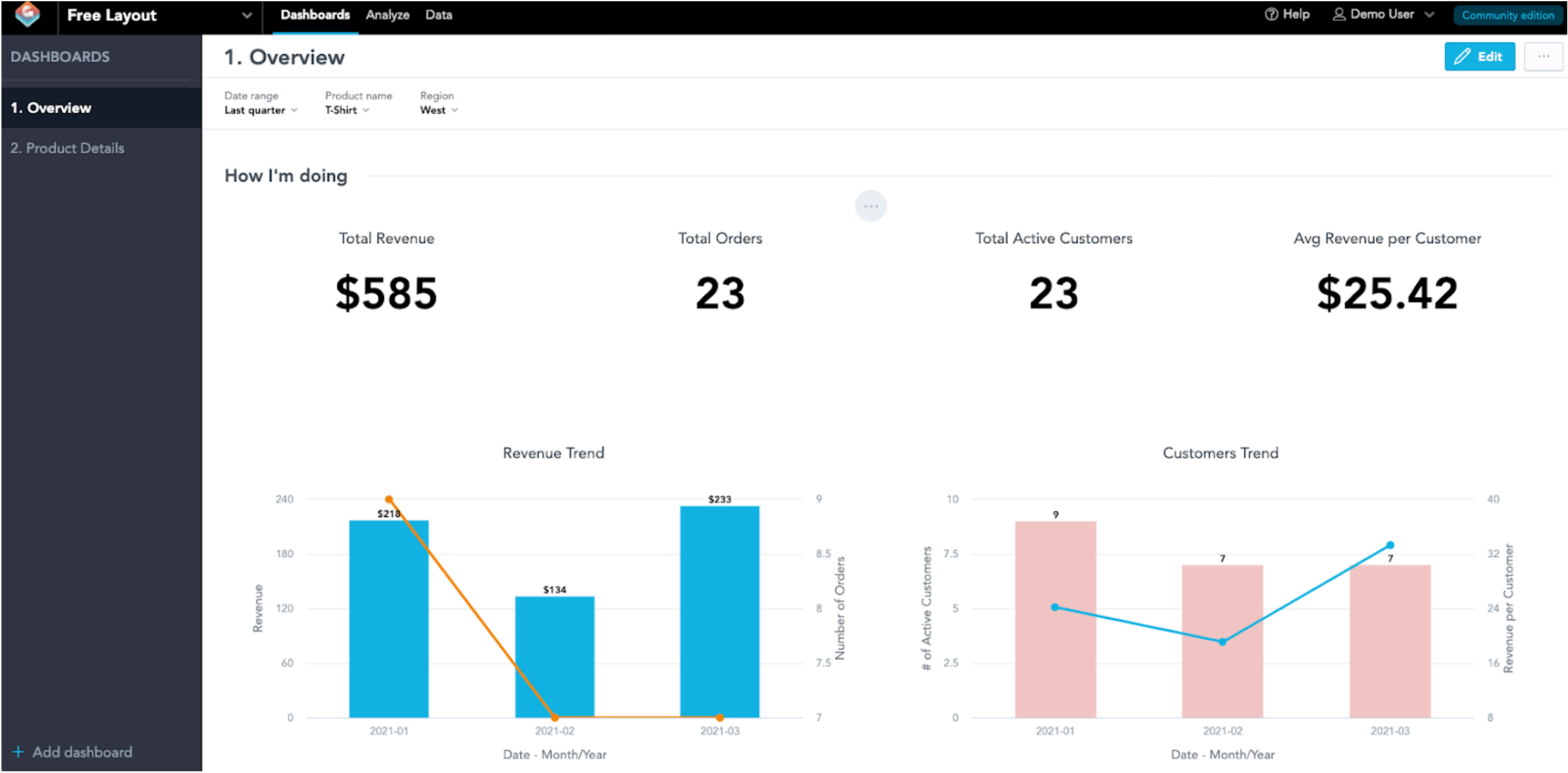
Diagram 5: T-shirt sales in the West for the last quarter
Creating New Insights to New Dashboard
If you think the visualizations in the dashboards did not answer the questions you have, you may create new insights to find out! (In GoodData, we call the visualizations as “Insights”) To create a new insight, click on “Analyze” and GoodData.CN will bring you to the analytical designer. In here, there is a canvas for your new insight along with all attributes and metrics on the left panel. On the left panel, there are selections of attributes and facts on the LDM, as well as the pre-defined metrics stored in “freelayout.json”. During the API call, GoodData.CN has imported the metrics we have defined for you (You may create your own metrics, to learn more in the documentation “Create Measures Using APIs” at https://www.gooddata.com/developers/cloud-native/doc/latest/getting-started/create-measure-api/ and the MAQL course in the GoodData University). On the left panel, there are 3 tabs, “All data”, “Measures”, “Attributes”. “All data” includes all attributes and metrics, while “Measures” has a list of facts and metrics. If you are not sure what the metrics do, hover over to the metric and a question mark would pop up, hover over to that question mark and it will pop up another message box that shows the description and definition of the metric (MAQL syntax).
Let’s say I am interested in the sales performance of each product category by region and I want to display in a stacked bar chart. First, move “Order Amount” from the left panel to the “Measures” box in the canvas, so do “Category” to “View By” box, and “Region” to the “Stack By” box. Then, select “Bar Chart” and GoodData.CN will give you this:
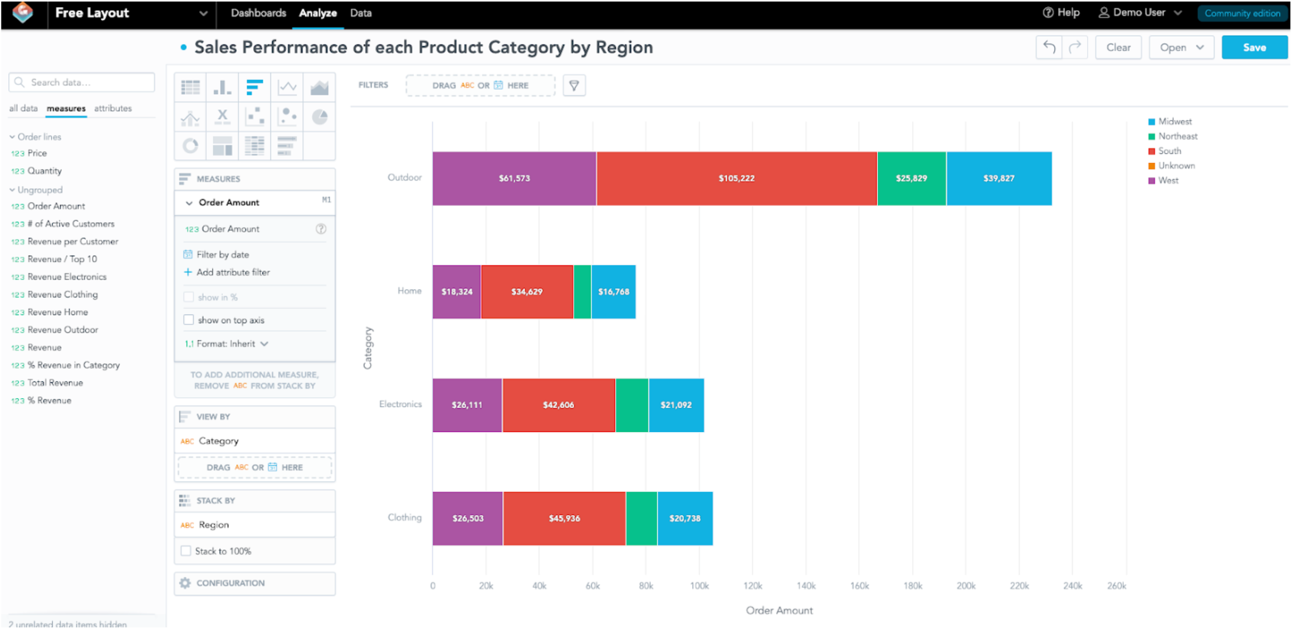
Diagram 6: Design a New Insight
It looks good to me, hit “Save” on the top right in order to save this insight. If you would like to create a new insight, click “Clear” on the top right to a new insight (Don’t worry, since you have save this insight, it is safe to clear this insight and you may retrieve this insight by clicking “Open” and select this insight to edit). Otherwise, you may click on “Dashboards” to create a new dashboard and add this new insight to.
Once you are back to the dashboard page, click on “+ Add dashboard” on the bottom of the left panel to create a new dashboard. Then you will land on a canvas to create a new dashboard. Go to the “Saved Insights” on the left panel find the new insight you have created, drag that insight to the canvas. Change the dashboard name (I will change it to “My Dashboard”), add a title and description in the only section, update the filter (The value(s) you selected on the filter(s) on this dashboard will become default value when you hit the “Save & Publish” button). Finally hit the “Save & Publish” button, your new dashboard will be added to your workspace.
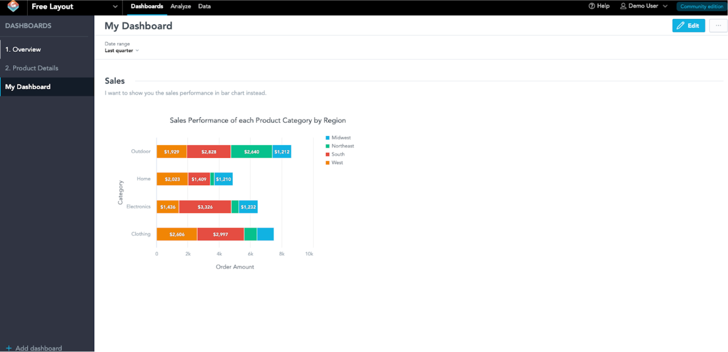
Diagram 7: “My Dashboard” added to “Free Layout”
Note: You may reference to the documentation “Create a Dashboard with Insights” at https://www.gooddata.com/developers/cloud-native/doc/latest/getting-started/create-dashboard/
If you are interested in GoodData.CN, please contact us.
Alternatively, test a trial version of GoodData Cloud: