
Time Dimension in Analytical Designer in GoodData.CN
Time is a useful entity for data analysis and is one of the most frequently used dimensions on dashboards. Sometimes you may want to compare the numbers in different periods. GoodData’s Analytics Designer (AD) provides an effective and easy-to-use UI to segment the fact(s) and/or metric(s) with various time dimensions in an insight or dashboard. In this article, we are going to show you how to utilize the time dimension in GoodData.CN’s AD.
GoodData.CN AD allows you to segment the fact(s) and/or metric(s) with the following dimensions (As of Version 1.3.0):
- Minute
- Minute in Hour
- Hour
- Hour in Day
- Day
- Day of Month
- Day of Week
- Day of Year
- Week
- Week of Year
- Month
- Month of Year
- Quarter
- Quarter of Year
- Year
It is easier to demonstrate the functionality with an example; let’s pretend we are analyzing the statistics of departure flights in an airport. Our dataset has Flight ID, departure time with date and time, destination, gate, and the aircraft model used in the table Departure Time. The following diagram shows the Logical Data Model (LDM):
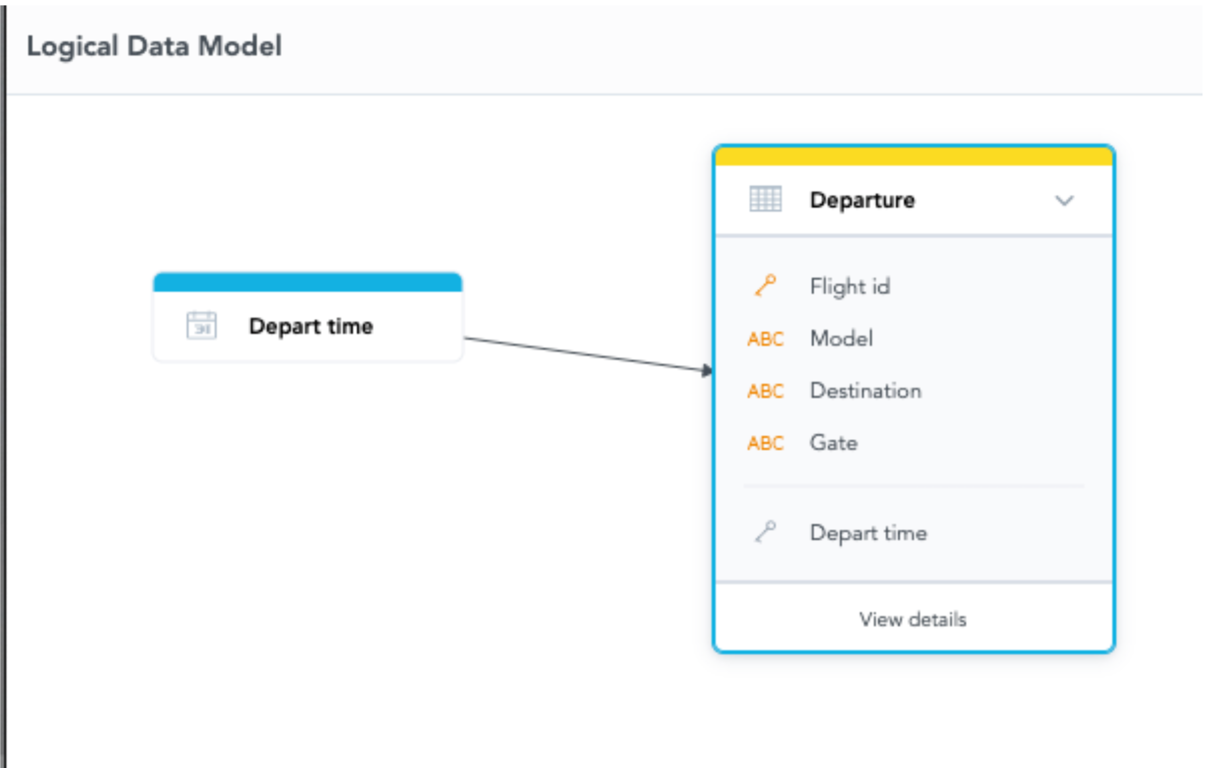
Diagram 1: LDM of Departure
In this dataset, we have the records of the flights with their flight number, departure date and time, gate, and destination in IATA code (Example: LAX for Los Angeles International Airport). We can count the number of flights departing with a different time dimension. Here is the MAQL query we are going to use in this article to count the number of flights:
SELECT count({attribute/departure.flight_id}) - # of Flights
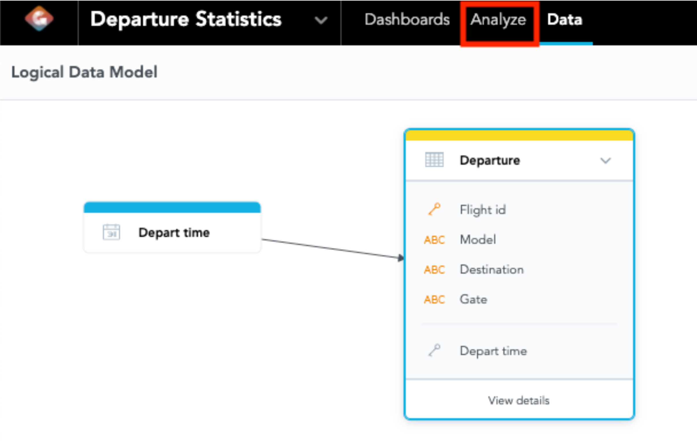
Diagram 2: Click “Analyze” to Get to Analytical Designer
Once you have defined this metric via API, you can click “Analyze” on the top panel (Red Box in Diagram 2) to get to Analytical Designer. Once you are in AD, you may find the attribute, facts/metrics, and date on the left panel. In order to visualize the metric segment by time, we have to drag the desired metric to measures and the date to rows as shown in Diagram 3:
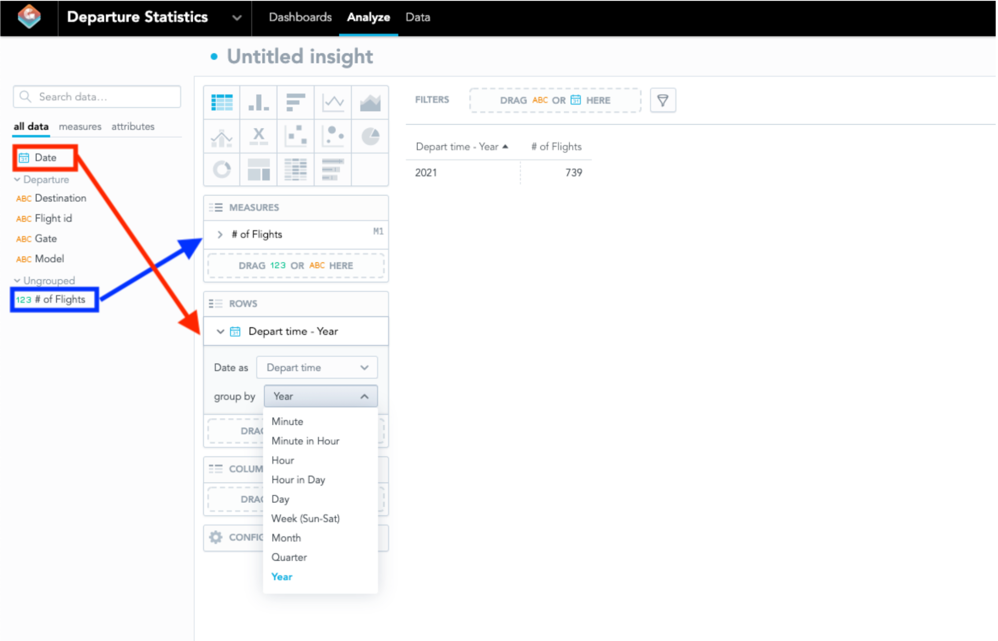
Diagram 3: Metric and Time Dimension in Analytical Designer
You may find the “Group By” box under that date attribute, and this is where you can select the date granularity on how to segment the data set. If we would like to learn how many flights were departed on each day, we may change the date granularity to “Day”, and we would have something like this in Diagram 4:
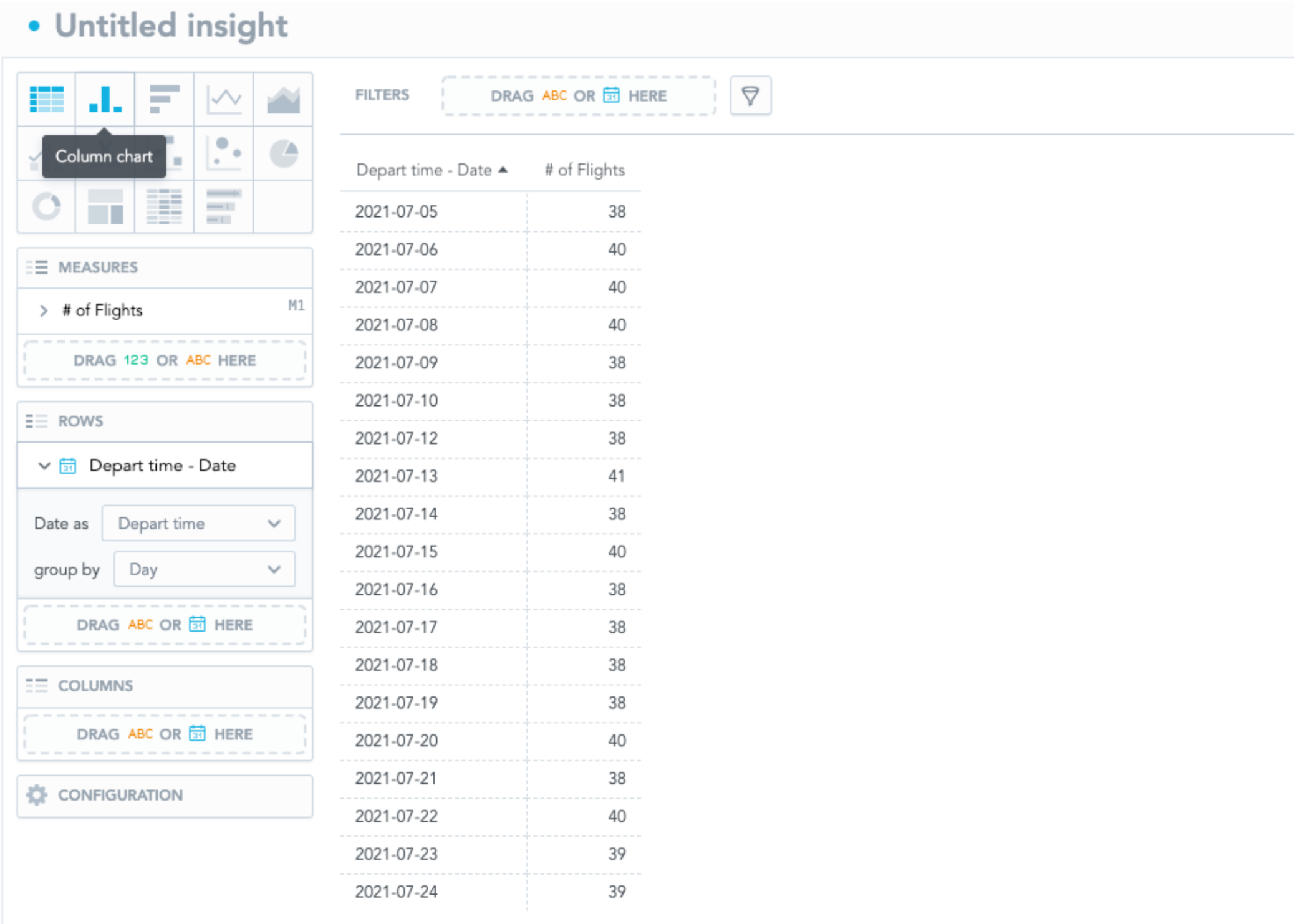
Diagram 4: Number of Flights Sliced by Day
If you are interested in finding the insight with a different time dimension, simply change the “Group By” selection to another date granularity. Some selections look similar but very different, and we will discuss the differences between “Hour” and “Hour in Day” in the next section.
Hour vs. Hour in Day
“Hour” and “Hour in Day” look alike, but they have different granularity. “Hour” is used when you would like to segment by a specific point of time. For example, the 8 AM hour slots on two different days are treated as two different attributes. Therefore, the flights in the 8 AM slot on 07/14 and 8 AM on 07/15 are counted in different attributes. Alternatively, “Hour in Day” is used when you would like to segment only the Hour time slot on any given day; it means 8 AM on two different days is counted in the same attribute. Continuing in the same example, the flights in the 8 AM slot on 07/14 and 07/15 will be counted in the same attribute because the logic only captures what hour slot the flights belong to and ignoring the date. Let’s conduct an experiment on these attributes and observe the difference through visualizations.
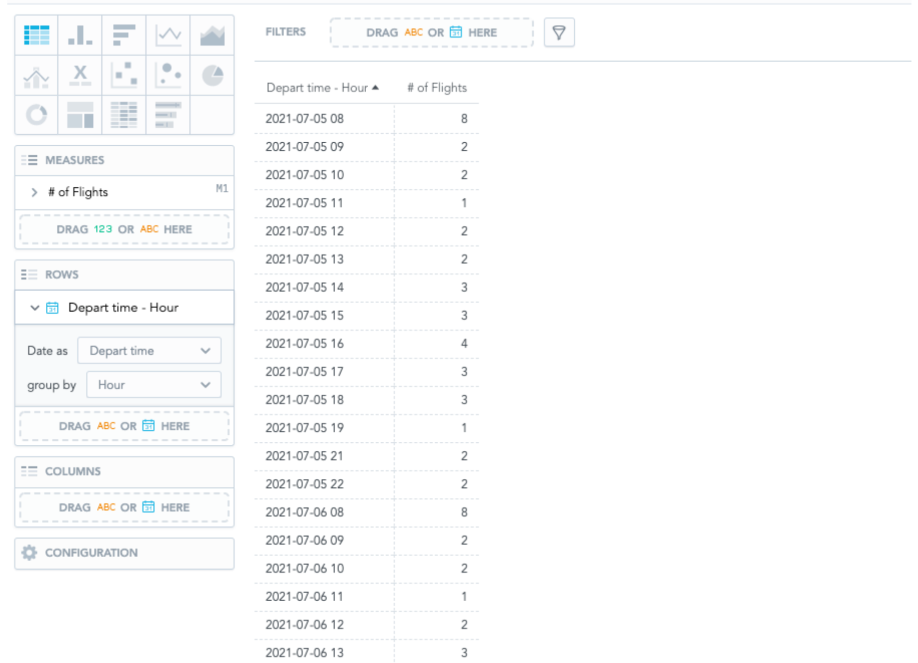
Diagram 5: Number of Flights Sliced by Hour
When we sliced the data set by “Hour”, we can see the Depart Time is sliced by the hour of each day. You may know the hour slot of 8 AM on 07/05 and 07/06 are listed on different rows. This selection is useful when you need the time dimension to be precise.
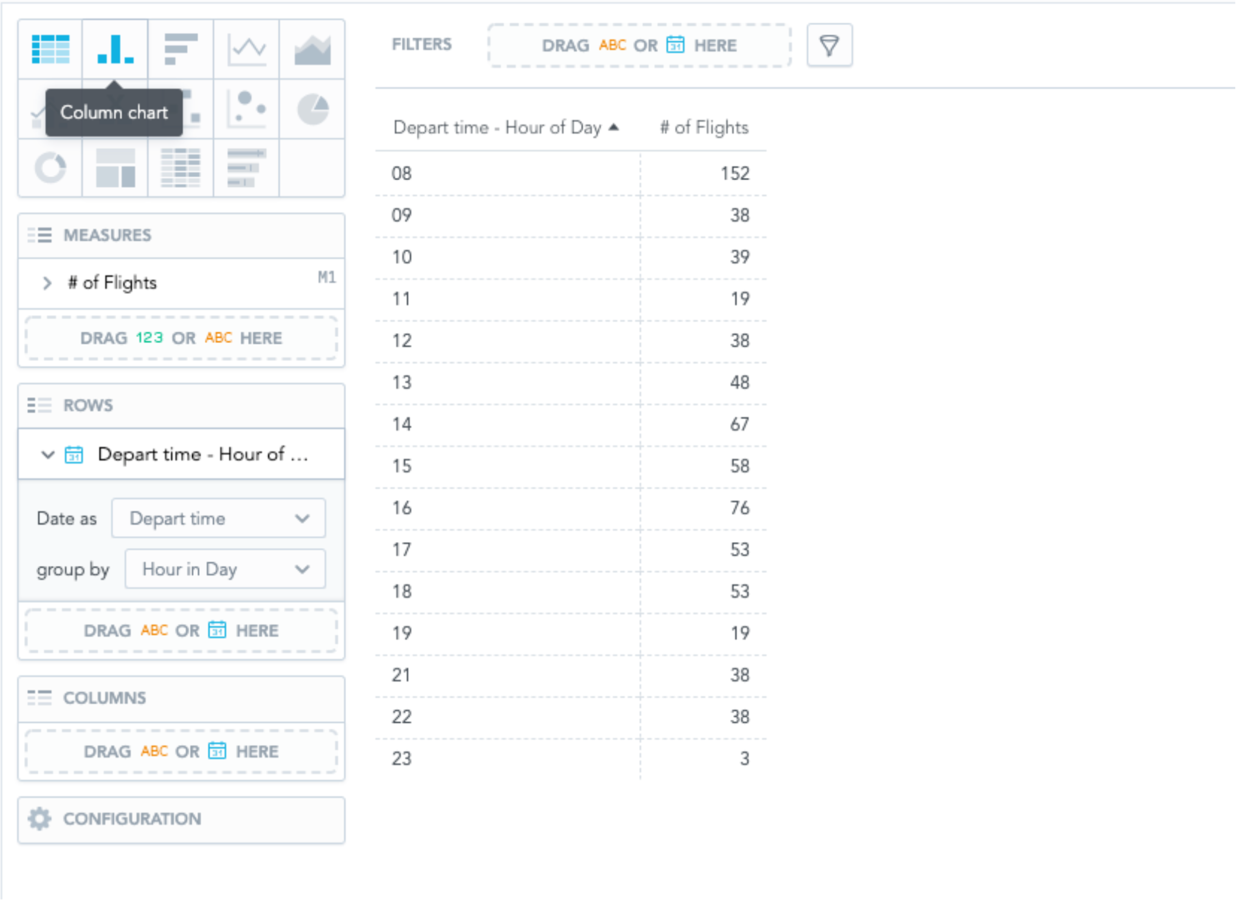
Diagram 6: Number of Flights sliced by Hour in Day
However, if you are only interested in the total numbers in every hour slot across all days, you would slice the data by “Hour in Day”. In Diagram 5, the attribute is only limited to the hour slot. It will count all flights in the 8 AM hour slot regardless of the dates. It means all the flight departure times between 8:00 AM and 8:59 AM will be counted in this row, regardless of what dates. It is useful when you only focus on hour slots across different time periods.
“Minute” and “Minute in Hour” function similarly but focus on minute slots instead.
Week and Quarter
“Week” and “Quarter” are labeled in the year and the serial number of the corresponding week or quarter. For example, if you have data segmented by the first two weeks of January in 2021, the attribute would be labeled in “2021-01” and “2021-02”. In our example, the attribute would be segment by “2021-27”, “2021-28”, and “2021-29” to represent the 27th, 28th, and 29th week of 2021 like in Diagram 6 below:
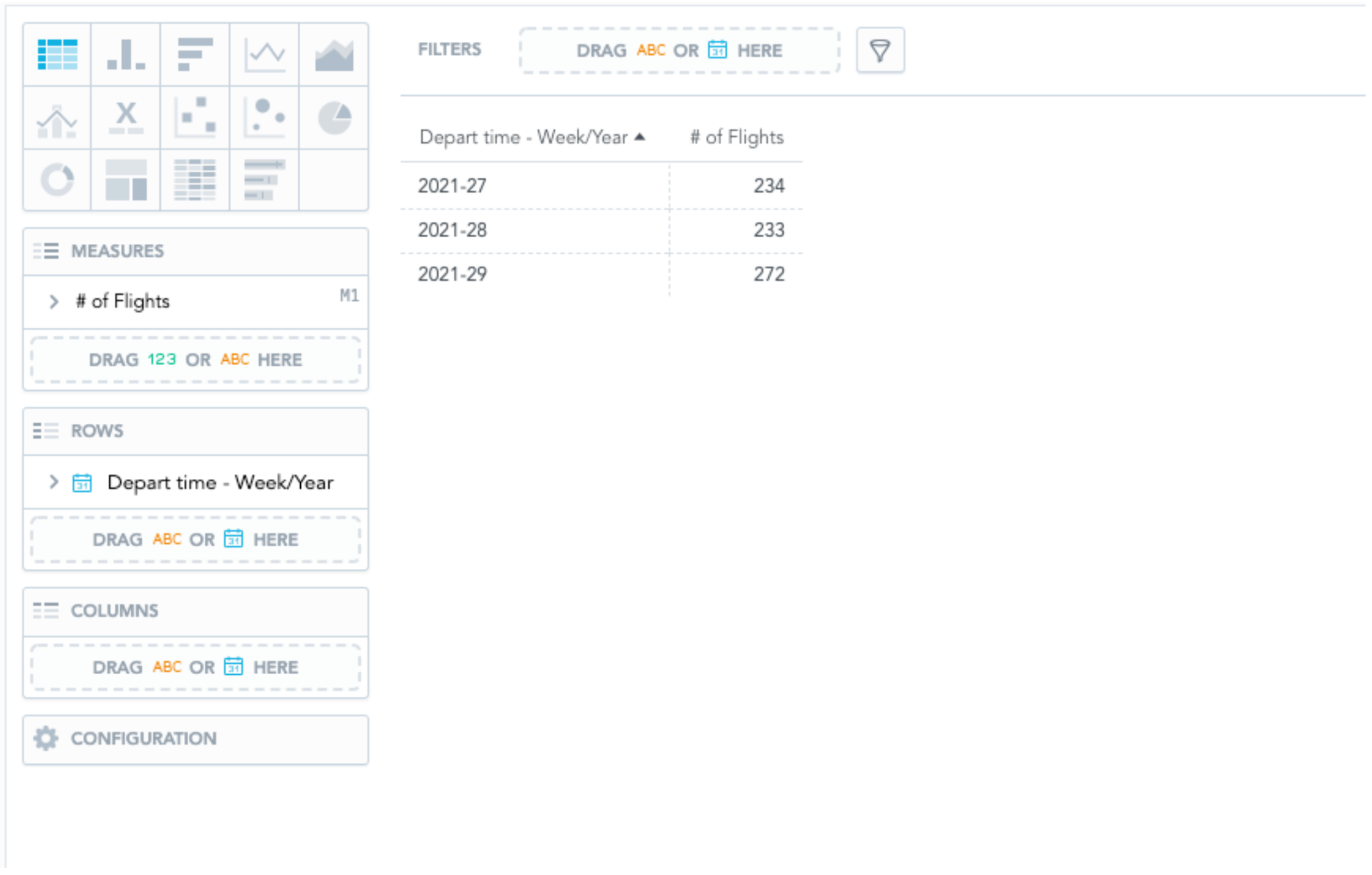
Diagram 7: Number of Flights sliced by Week
If you have sliced the data set by “Week”, you may not find any information about which month the week belongs to. We will discuss how to resolve this problem in the next section by segmenting multiple time dimensions.
Likewise, the data set is sliced by “Quarter”, the attribute label will be displayed with the format of “year-quarter”. For example, Q3 of 2021 will be labeled as “2021-3”.
Multiple Time Dimensions
GoodData.CN allows you to segment the data set with multiple time dimensions. Let’s reflect back to the example in the last section where you want to segment the data set by “Week” and display each month the week belongs to on the visualizations. To solve this, you would drag two date attributes to segment the data set by both “Week” and “Month” to display the week and month in the attribute column or on the x-axis.
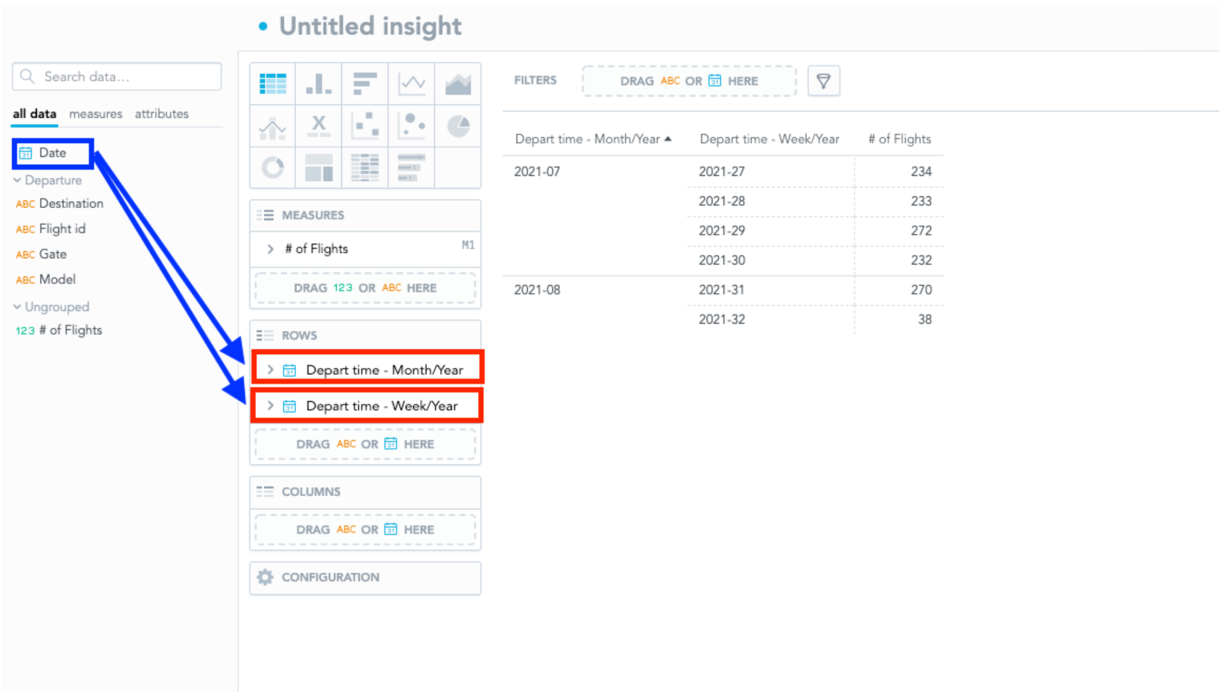
Diagram 8: Data Segmented by Week and Month
As shown in Diagram 8, you may drag the “Date” attribute on the left panel more than once to Rows, and select different desired date granularity (The order of date granularity in Rows will be reflected in the visualization). Since I have selected “Month” and “Week”, the table will be showing the number of flights by week. And now I can identify which month the week belongs to.
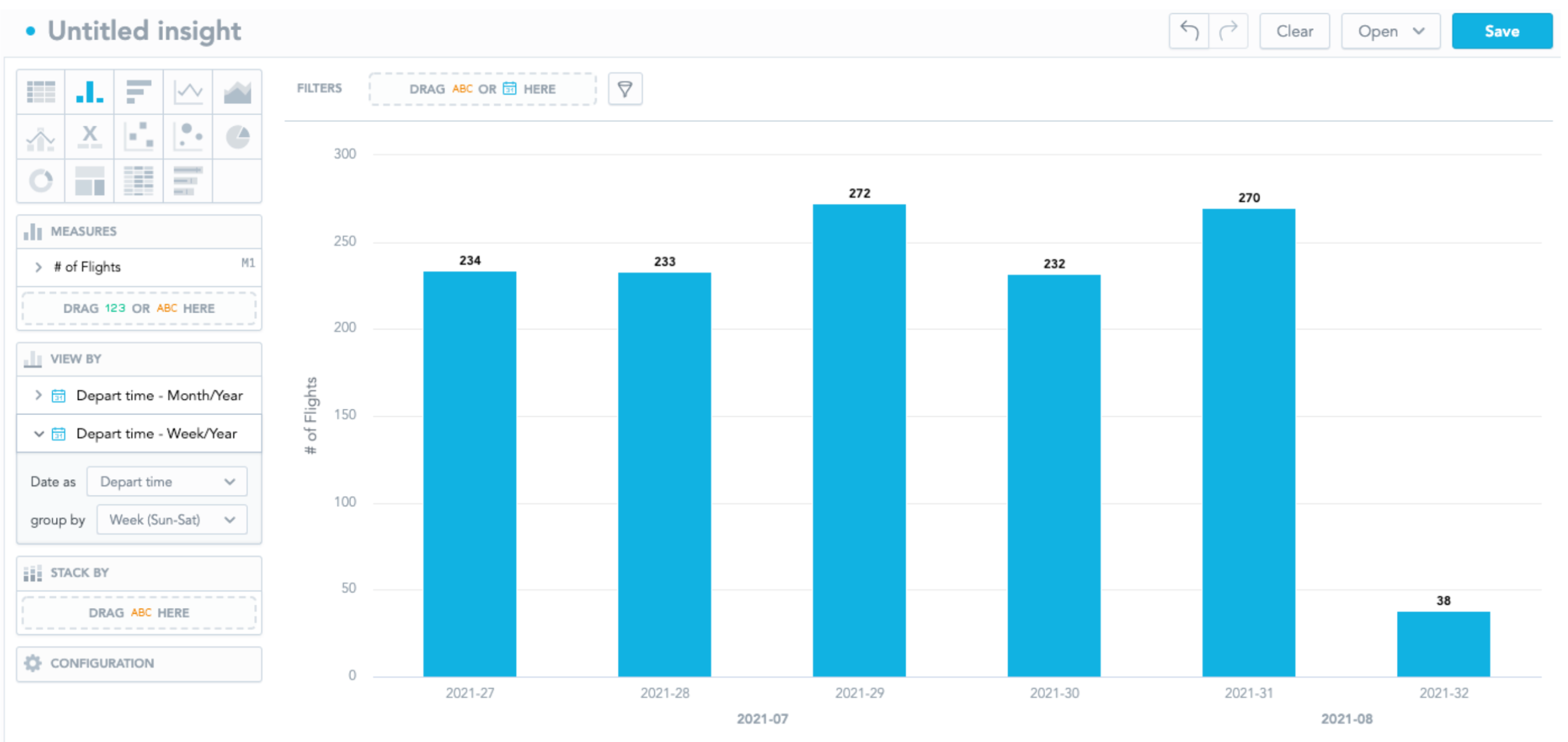
Diagram 9: Data Segmented by Week and Month in a Bar Chart
Multiple time dimensions in insight are very useful when segmenting with “Week”. "Week" is a frequently used time dimension in the airline industry, but the very natural question to readers is which month the week on the x-axis belongs to; multiple time dimensions allow readers to find the answer on the chart without confusion.
However, this functionality is only supported by discrete data type visualization, such as bar charts; this is not allowed in any continuous data type visualization, particularly line charts and combo charts. If you switch the chart to a line chart, the exceeded Date attribute will be dropped automatically (The line chart only allows 1 date attribute and at most an additional non-date attribute).