Analytical Designer: New Options in Date Attributes
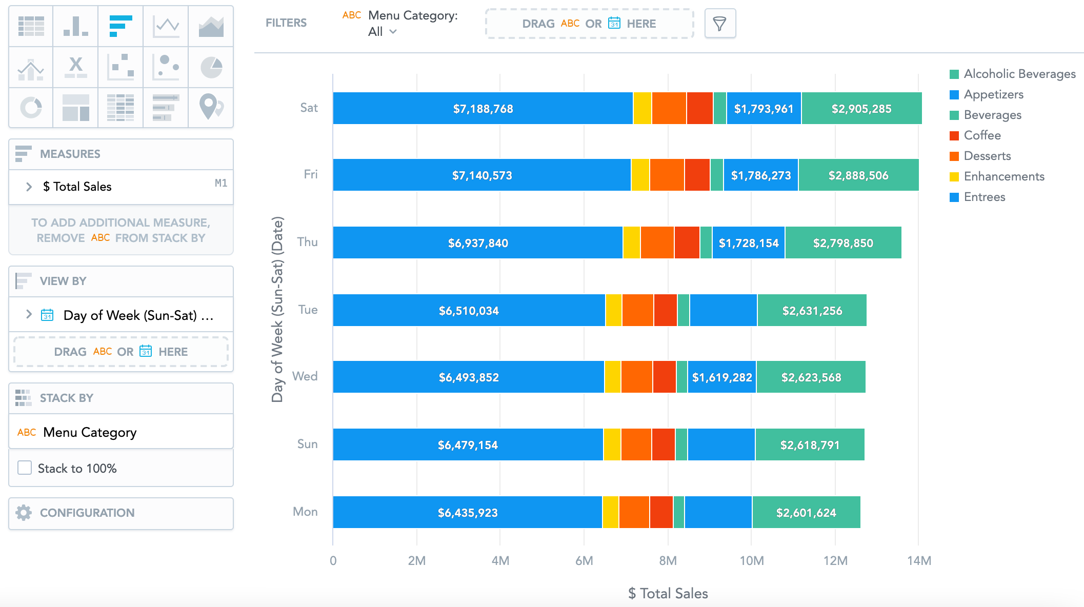
When slicing and filtering your insights by date, you can now use additional options, such as day of the week, week of the year, month of the year, and others.
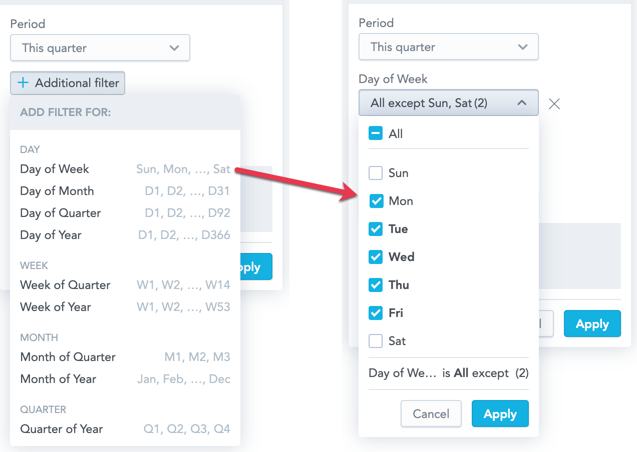
For example, you can display how the sales of individual categories are distributed throughout the week.
Learn more:
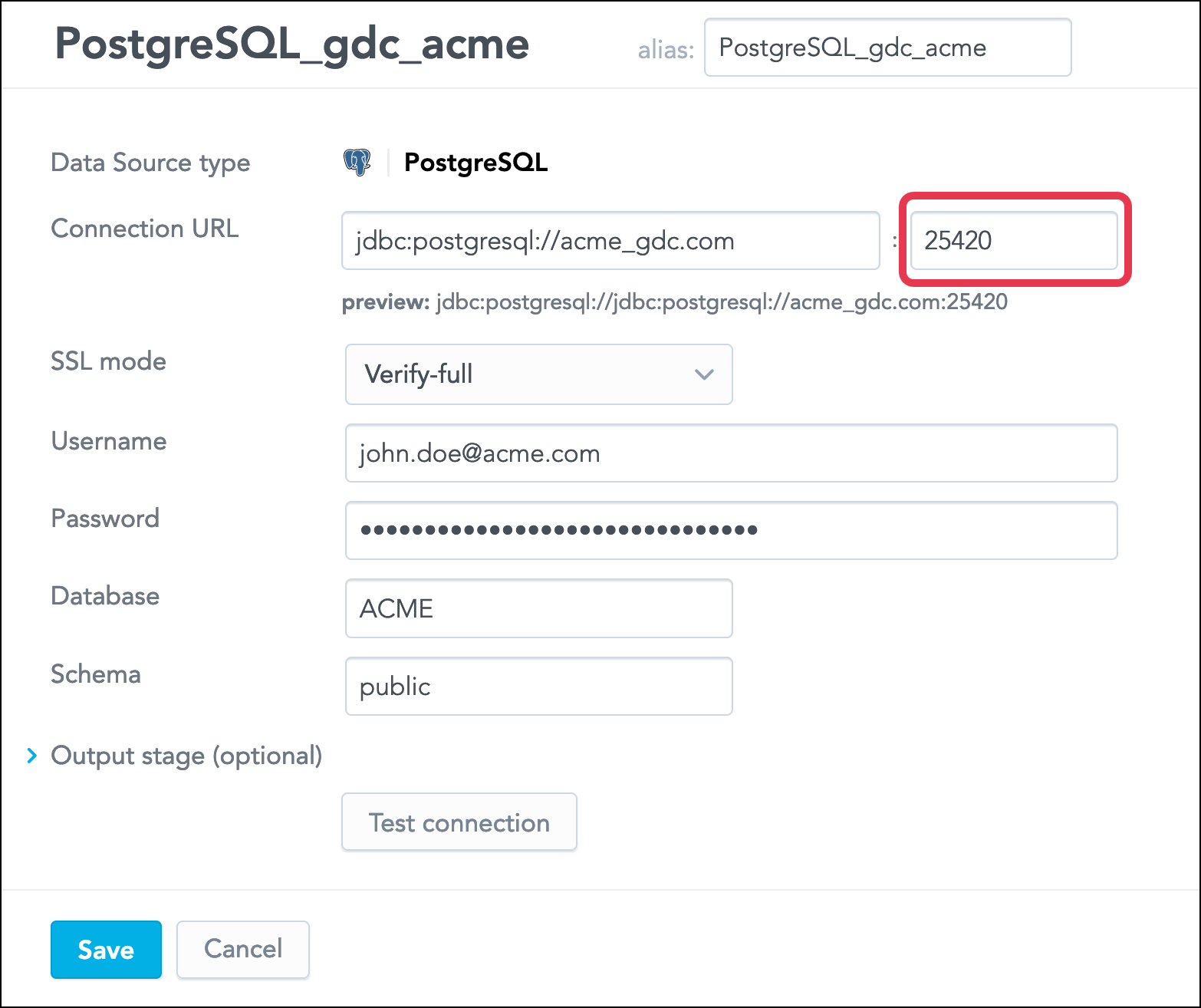
Set a Custom Port for a PostgreSQL Data Source
When creating a Data Source for a PostgreSQL database, you can now set a custom port in the connection URL instead of using the default one, 5432.
You can use a port from the following permitted ranges:
5420-545015420-1545025420-25450- ...
65420-65450
Learn more:
GoodData.UI Version 8.4 Available: Visualization Definition Placeholders, Visualization Titles, and More
We have released Version 8.4 of GoodData.UI, our powerful library for building analytical applications powered by GoodData.
What's new in GoodData.UI Version 8.4
- Visualization definition placeholders
Visualization definition placeholders let you dynamically change the data coming to visualizations (such as measures and attributes) based on a specific user action.
For more information, see Visualization Definition Placeholders. - Visualization title displayed in InsightView
The InsightView component now has a new property,showTitle, that you can use to display the title of the rendered visualization.
For more information, see InsightView. - Tooltip visibility
You can now disable tooltips in charts.
For more information, see Chart Config -> Configure tooltip visibility.
Note: This feature is not available in Analytical Designer. - Responsive legend as a popup
You can now make the legend appear as a popup if the visualization is rendered in a too small container.
For more information, see Chart Config -> Change legend properties.
Note: This feature is not available in KPI Dashboards/Dashboards but we are working on implementing it. - Error and loading components in Execute and RawExecute components
The Execute and RawExecute components now have new properties,ErrorComponentandLoadingComponent, that you can use to customize what content is displayed when a visual component is in its error or loading state, respectively.
For more information, see ErrorComponent and LoadingComponent. - Date Filter component stable
The Date Filter component left beta and is now considered stable.
For more information, see Date Filter.