When it comes to company design, color-coding, and branding, the GoodData platform comes with several means of styling to help achieve the desired result. In this article, we’ll walk through different approaches to customize the looks of your analytics, and we’ll focus mainly on the <ThemeProvider /> component that’s part of the GoodData.UI library.
Out of the Box
Before we deep dive into GoodData.UI’s styling capabilities, you should know that responsive Dashboards and the data exploration app Analytical Designer — tools available out of the box — already provide you with basic customizations. You can turn on and off the x-axis and y-axis, hide the legend, and modify the series’s colors for each individual insight. This is very quick and easy to do and proves to be quite handy and sufficient for most cases.
If you need to change individual colors within every insight, the next logical step is to import a custom color palette to replace the one provided by default. This can be done via API by a user with Administrator permissions as described in Importing Custom Color Palettes. After importing the custom color palette, all insights — the ones you had already created and the ones you will create in the future — will respect this new color palette.
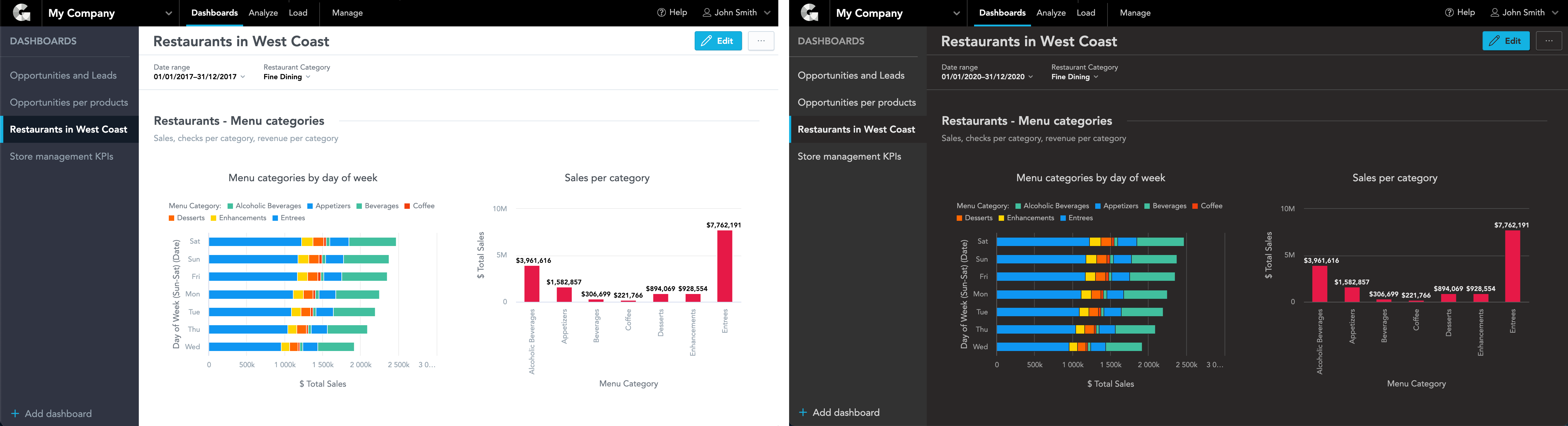
Custom Themes
The looks of the whole Dashboards application can be altered by creating Custom Themes. This can also be achieved without GoodData.UI, although the themes use special JSON structures with CSS properties. You can change various colors, fonts, visual elements (e.g., buttons and tooltips), Dashboards navigation, filter bar, and many others. See the complete list of theme properties for more information.
With custom themes, it is even possible to define a so-called dark mode. For inspiration, check out these examples and learn more about How to Create a Dark Theme for your GoodData Workspaces.
Theme Provider
Changing the looks of Dashboards is cool, but let’s now focus on the insights. Analytical Designer allows us quickly change the colors of the series. Still, sometimes there’s a need for even more granular styling: custom grid color, axis color, background color. All of this and much more is possible with the Theme Provider.
The following only applies to GoodData.UI components and cannot be currently applied to Analytical Designer or Responsive Dashboards.
<ThemeProvider /> is a React component available as part of the GoodData.UI JavaScript library, specifically part of the @gooddata/sdk-ui-theme-provider package. It can become extremely useful when implementing a custom analytics application with GoodData.UI.
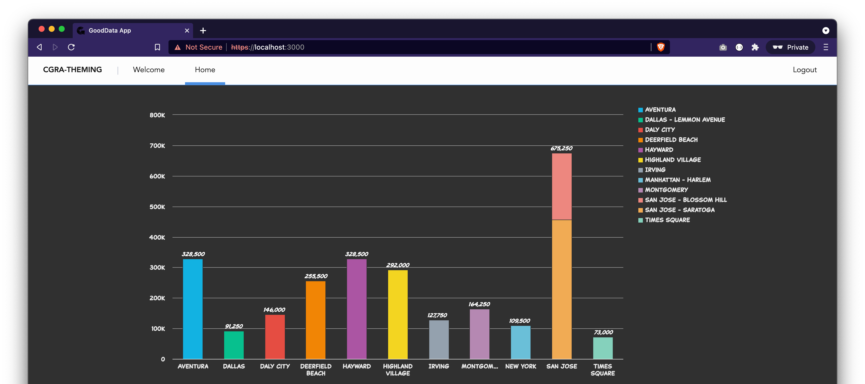
Let’s say you use Accelerator Toolkit to create a new boilerplate project from scratch. The tool will generate, among others, file src/routes/Home.js. This is a good starting point; let’s extend it just a bit by adding a column chart that will serve as our styling example. It can look something like this:
import React from "react";
import { InsightView } from "@gooddata/sdk-ui-ext";

import Page from "../components/Page";

const Home = () => {
  return (
    <Page>
      <div style={{ height: 400 }}>
        {/* next line references column chart created in analytical designer */}
        <InsightView insight="aby6oS6DbpFX" />
      </div>
    </Page>
  );
};

export default Home;
To apply the Theme Provider with a custom theme, first, you need to import it:
import { ThemeProvider, useTheme, useThemeIsLoading } from "@gooddata/sdk-ui-theme-provider";Then you want to define and import the custom theme definition. You can check out some of our examples or see the full declaration of ITheme for all available properties. Here’s also a customTheme.js definition for your convenience that you can use.
import customTheme from "../customTheme";We now need to wrap our Home component inside the ThemeProvider, like this:
const ThemedHome = () => (
  <ThemeProvider theme={customTheme}>
    <Home />
  </ThemeProvider>
);

const Home = () => {
  const theme = useTheme();

  return (
    <Page>
      <div style={{ height: 400 }}>
        <InsightView insight="aby6oS6DbpFX" />
      </div>
    </Page>
  );
};

export default ThemedHome;
As we can see, this is already making changes. If your customTheme is being loaded from workspace metadata, the correct approach is first to check that the theme has finished loading:
const Home = () => {
const themeIsLoading = useThemeIsLoading();
const theme = useTheme();
if (themeIsLoading) {
return <p>Loading theme resources…</p>;
}
return (
<Page>...</Page>
);
};
Lastly, we probably want to unify the background color of the insight with the application’s background color. In other words, we want to reference the colors from our theme and apply them wherever else we see fit. This should be very simple:
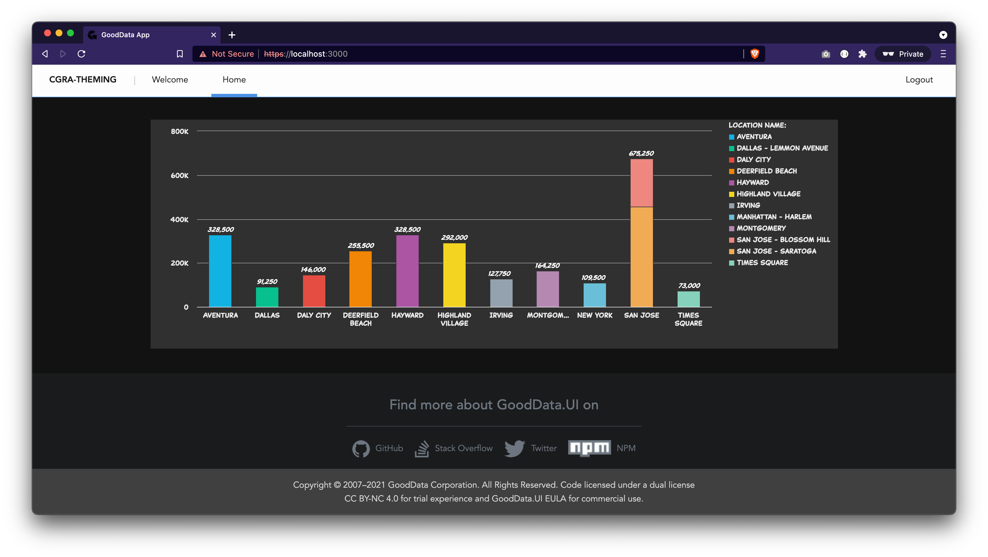
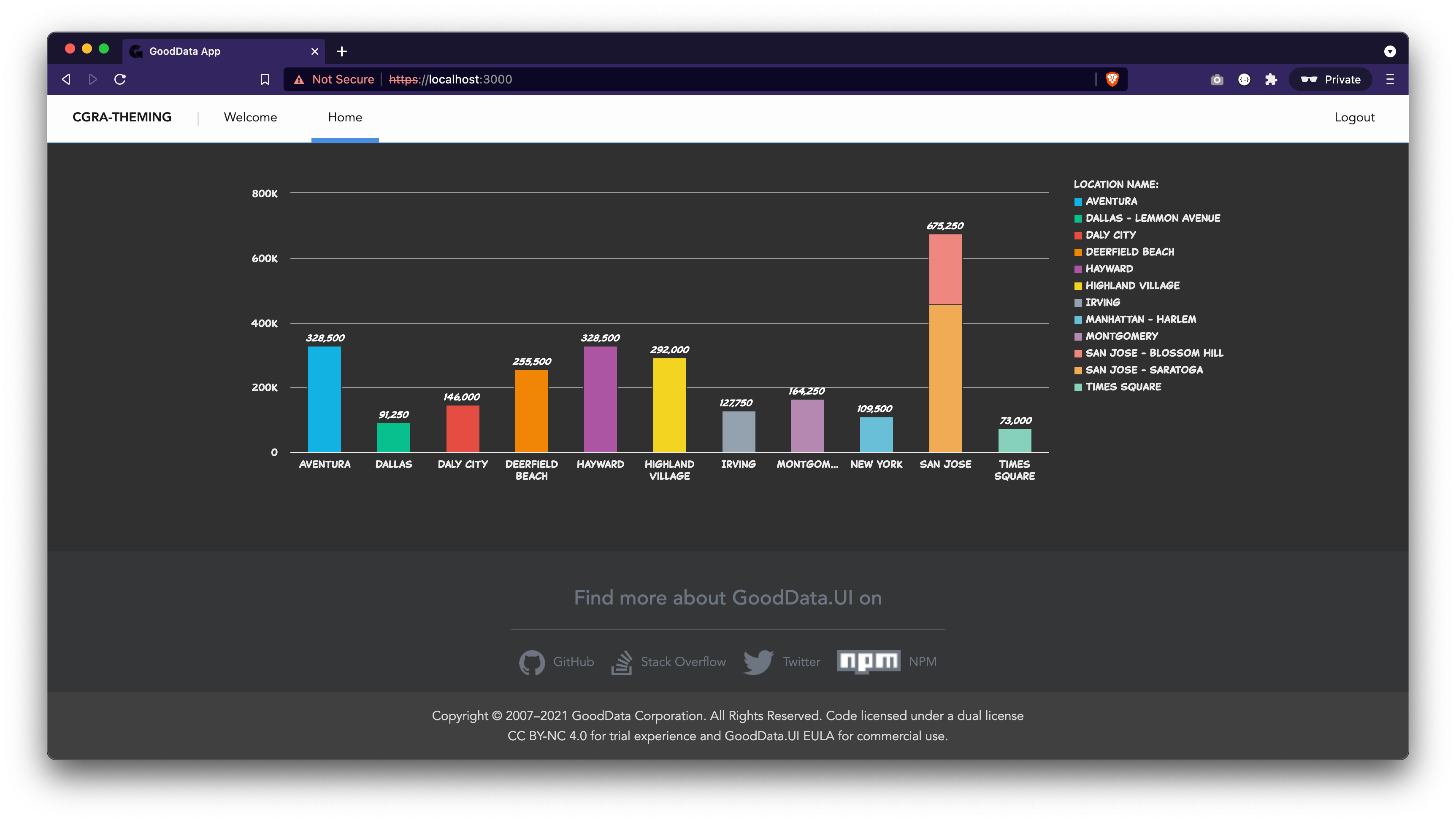
<div style={{ backgroundColor: theme.palette.complementary.c0 }}>...</div>The complete code of src/routes/Home.js should now look like this, and the result can be seen in the screenshot below.
import React from "react";
import { InsightView } from "@gooddata/sdk-ui-ext";
import { ThemeProvider, useTheme, useThemeIsLoading } from "@gooddata/sdk-ui-theme-provider";

import Page from "../components/Page";
import customTheme from "../customTheme";

const ThemedHome = () => (
  <ThemeProvider theme={customTheme}>
    <Home />
  </ThemeProvider>
);

const Home = () => {
  const themeIsLoading = useThemeIsLoading();
  const theme = useTheme();

  if (themeIsLoading) {
    return <p>…</p>;
  }

  return (
    <div style={{ backgroundColor: theme.palette.complementary.c0 }}>
      <Page>
        <div style={{ height: 400 }}>
          {/* line below renders a column chart create in analytical designer */}
          <InsightView insight="aby6oS6DbpFX" />
        </div>
      </Page>
    </div>
  );
};

export default ThemedHome;
Custom Components
When customization is still not enough, it is time to create a fully custom chart.
Please note that fully custom visualizations cannot be plugged into Analytical Designer or Dashboards at the moment. However, it is on our long-term roadmap to make it available for every customer to create and add custom visualizations into Analytical Designer and Dashboards.
Read more about custom visualizations in our GoodData.UI documentation, or sign up for a free course GD.UI Demo - Building Custom Visualizations in our GoodData University.
Summary
In this article, we covered different styling capabilities of the GoodData platform:
- Basic configuration available in Analytical Designer,
- Importing custom color palettes into workspaces,
- Custom Themes to alter the looks of Dashboards (including the dark mode),
- Theme Provider to change the looks of GoodData.UI components, and
- Endless possibilities of fully custom components.