Hello
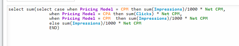
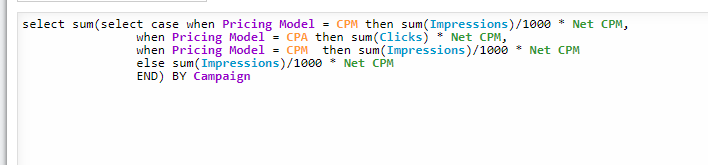
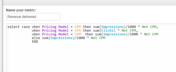
I have created a conditional metric to calculate revenue (see screenshot below).
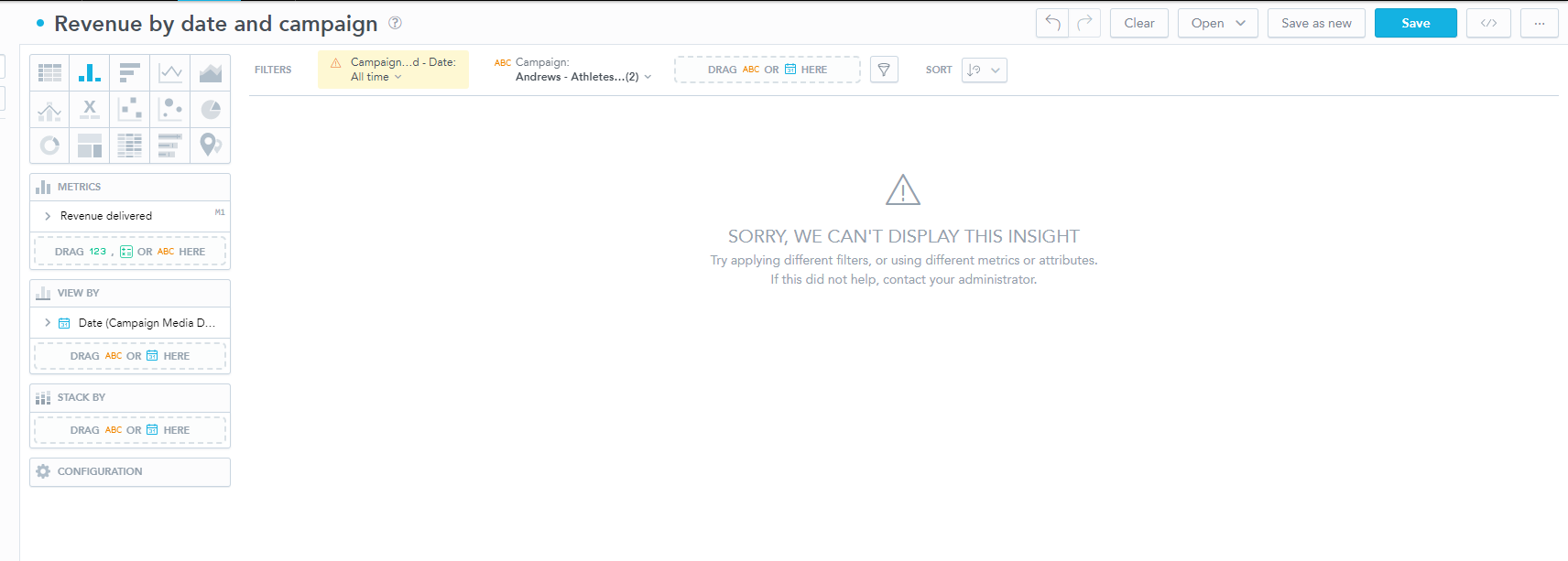
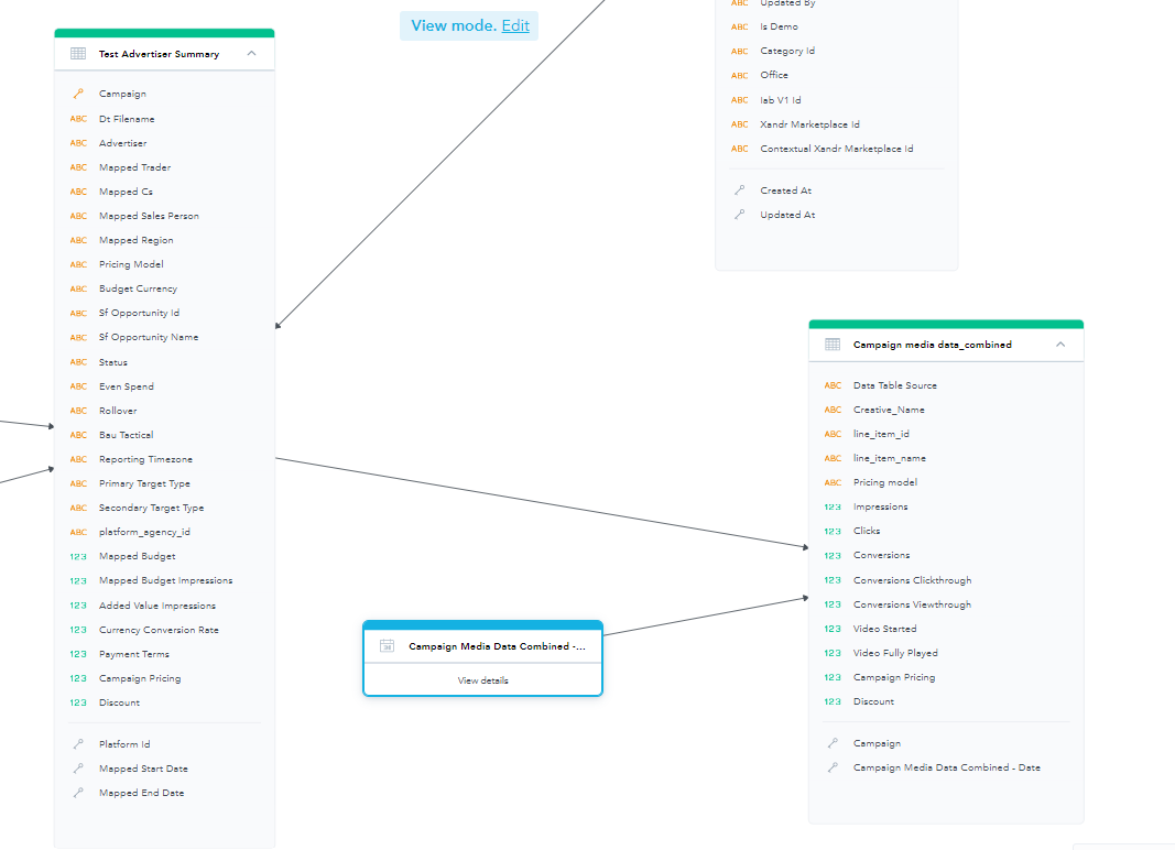
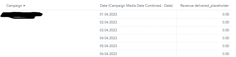
I want to show the revenue by date in a bar chart and have an attribute campaign filter so I can select the revenue for the specific attribute. I have created a table with the date, the attribute and the metric and it is showing me the revenue by campaign and date. However, when I try to change this to a bar chart, removing the campaign attribute and have only revenue and date, the visual breaks.The campaign attribute and pricing model is based off a different attribute table in my model to the fact table which includes the date.
I need a chart to show overall revenue by date, that can be filtered by the campaign.
Thanks
Best answer by Moises Morales
View original