Solved

Column chart How to color by group

  • 9 April 2021
  • 1 reply
  • 53 views

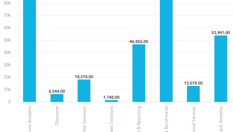
I have a simple Column chart see below - in which I want to break down each business line by Sales region.  For Example instead of 1 bar per Business line I need 4.  Each should be a separate color.

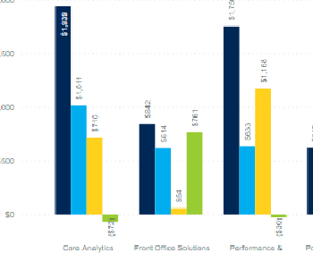
See example from another tool.


icon

Best answer by Iva Gasparekova 9 April 2021, 22:38

View original

1 reply

Userlevel 3

Hey Linda,

I understand what you are trying to achieve, but I am afraid this is not possible right now. However, there are multiple options how to stack the measures. 
You can for example view measures by two attributes, if you add them to the View by section. You can find more information here.

Reply